Raymond Coleman Design Brand Guide
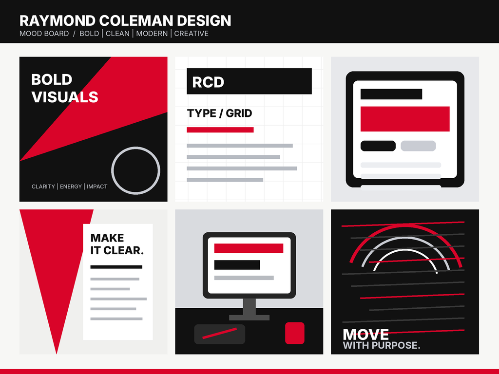
Mood Board
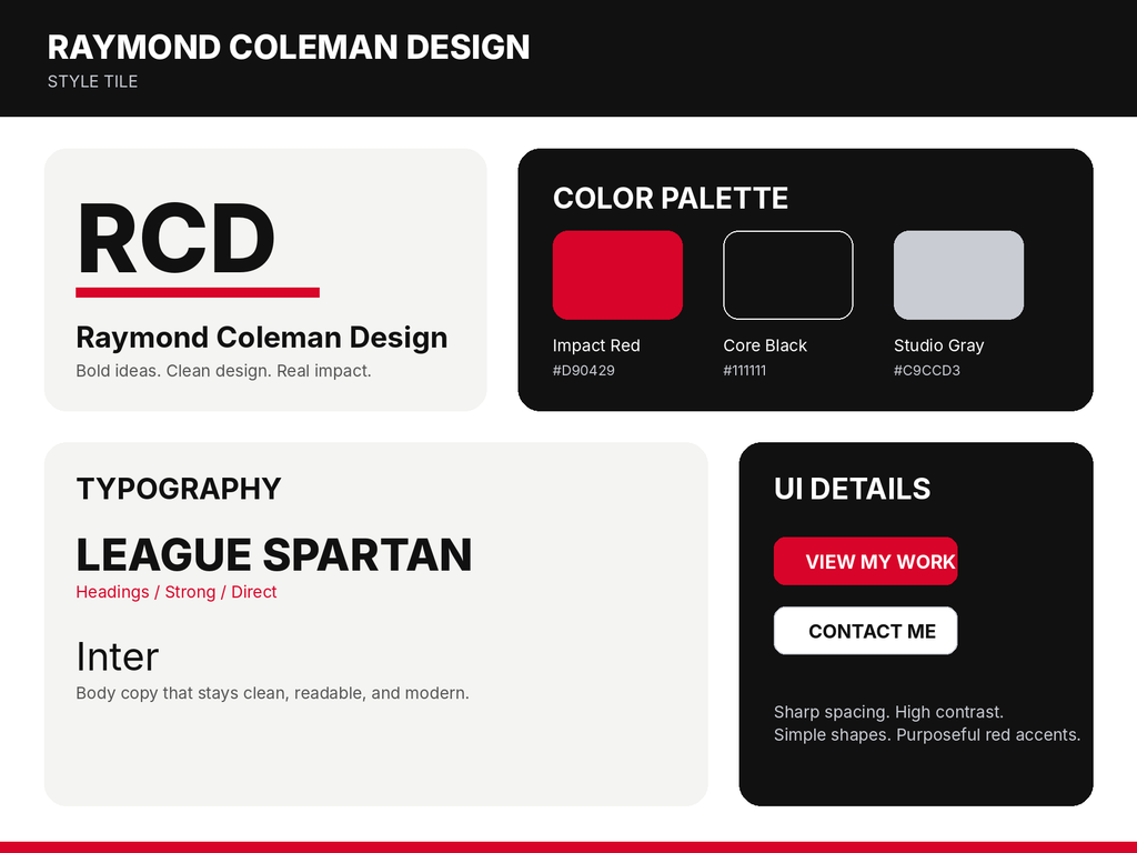
Style Tile
Brand Reflection
For my personal brand, I wanted the design to feel bold and creative without becoming too busy. Working through the branding workbook helped me narrow down what I actually want my work to communicate instead of choosing colors and fonts just because I like them. I chose creativity, clarity, authenticity, and growth as my main values because they connect to how I want to approach design and continue improving. My mission is focused on creating clear visual work for small businesses, creators, and growing brands, while my vision is to create work that helps good ideas get noticed and remembered.
For the visual direction, I chose red, black, and light gray. Red gives the brand energy and helps important elements stand out, while black keeps the overall look strong and professional. The light gray gives the design some breathing room so the site does not feel too heavy. For typography, I chose League Spartan for headings because it has a bold, modern look, and Inter for body text because it is clean and easy to read. My tagline, “Bold ideas. Clean design. Real impact.” brings those choices together and summarizes the kind of work I want the brand to represent.
The mood board and style tile helped me see how these choices can work together before building the full website. I plan to use the red mainly as an accent instead of filling every section with it, keep layouts simple and organized, and use strong typography to guide visitors through the site. These decisions will influence the homepage, portfolio pages, buttons, and other site elements so the final website feels consistent from page to page.